New Fennec alphas enable mobile Firefox trials on desktop PCs
![]()
It's not really a "community technology preview" of the first edition of Firefox for mobile devices, as some have described it to be. Rather, it's a peek inside the minds of people trying to solve some fundamental design problems on small platforms.
If you don't own a Nokia N810 device, then you'll have a difficult time testing on a real handset the Mozilla organization's latest alpha builds of Fennec, its concept browser that should at some point adopt the name "Firefox Mobile." But it will take more than just the N810 users of the world to form a clear consensus around some of the mobile browser's bolder ideas, which include tucking most of the functional elements behind hidden panels outside the left and right margins of the Web page -- an idea inspired by some concept videos rendered last June by Mozilla Labs' Aza Raskin.
So the latest Fennec alphas for Windows, Mac OS X, and Linux aren't really tests of more Mozilla browsers in a desktop environment. Rather, they present you with screens you can resize yourself (unlike a real mobile handset) to approximate the aspect ratio of a touchscreen handset. You then operate Fennec as though your mouse pointer were your finger on the phone's panel, which is why you won't find scrollbars; instead, you slide the page around with the pointer.
The design element that Fennec is built to test is whether mobile users can get used to functionality they can't always see. When the idea of Common User Access was created for desktop PCs in the late 1980s, it was with the idea that if you placed functionality in the same visible locations all the time, people would get so accustomed to it that they wouldn't have to be completely retrained whenever new applications were released. But on a mobile playing field -- never mind the resolution of your display -- real estate is limited, because functional controls have to be big enough to be both seen and touched, yet small enough to avoid consuming valuable page space.
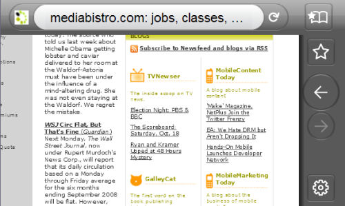
So the current Fennec alpha is a test of some new ideas, with the full knowledge that they may not be fully embraced by the public. One idea is a test of whether the browser really needs to display both the page's title and URL simultaneously. Fennec's address bar is an obvious on-screen device, but after you type an address into it and it loads the page, it replaces the URL with the page's title -- what normally appears in the title bar at the top of Firefox's or IE's window.
The first surprise I discovered is that the absence of the ever-present URL is no big loss. If you think about it, even though mobile phones tend to show the phone number of the person with whom you're speaking, you don't really pay attention to that number on the screen all the time -- especially if you're holding the handset to your ear. So the constant reminder of the URL may be a redundancy that a mobile browser could easily do without.
On the other hand, I've found myself wondering whether the omnipresence of the Web page title is all that necessary. One problem, however, is finding a workable way to get rid of it, especially considering it also fulfills the function as Fennec's principal navigational tool. Today, I've noticed some inconsistent behavior: Sometimes just after a page is rendered, scrolling the page down will scoot the address bar off-screen; to get it back, you have to scroll the page back up all the way to the top. Try that a second time, though, and you'll find the address bar doesn't go away. And maybe with a third time, it won't go away either, but it will for the fourth, and periodically thereafter.

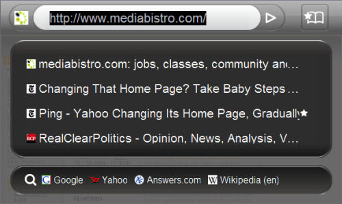
You tap the title/address bar once to place the cursor there, which converts it back from a title indicator to a URL. The remainder of the screen opens up to show the recent browsing history, and along the bottom are some handy search buttons which can take the user immediately to Google, Yahoo, Answers.com, or Wikipedia. Presumably, the user of the final edition should be able to choose which search engines appear here.
Only within the confines of the PC does the absence of scrollbars really strike one as an omission; for this Fennec trial, you have to remind yourself you're not really on a PC, and that your mouse pointer is a finger. A click-and-drag operation simulates dragging your finger along the surface, and if you do it with a whisk, it simulates the kind of "throwing" motion that's become commonplace on the Apple iPhone. For the sake of this alpha, Fennec's rendering response isn't too smooth -- rather, it appears to be a sort of placeholder for a smooth "throw" or "toss" in the final mobile edition.
The mouse scroll wheel behaves as a zoom operator -- which is odd, because there doesn't appear to be an obvious counterpart to the scroll wheel on a touchscreen handheld. Double-tapping a region of the page does attempt to zoom into that region, though with the current alpha we've been testing, this feature rarely works properly.

Having the browser's functionality features tucked away in the margins outside the page may be a necessary, if not the most obviously desirable, factor in using complex applications on a small surface. This makes using the Back button in Fennec a less-than-reflexive process; you have to slide the page to the left, reveal the button, and then tap it. At the very least, however, this is the same sequence of gestures you take every time you want to go back one page; so although it takes two steps instead of one, they're always the same two steps. That's not too bad a sacrifice, and a better way of making this simple feature work than the presently inconsistent address bar. The bookmarking button appears here too, and so far, the location seems sensible.
Next: Does Fennec have a workable solution for on-screen tabs?