PDC 2008: Look out for the 'delighters' in Windows 7
Color, a Microsoft design team discovered with the aid of a focus group, is quintessential to a positive user experience. In advising developers to add delight to their apps, a team leader made a revelation about Windows 7's mission.
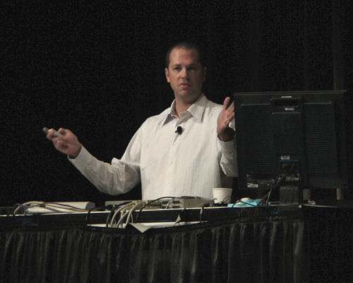
LOS ANGELES - During a mid-day session on best practices for designing applications to take advantage of Windows 7, Microsoft's principal design manager Samuel Moreau told attendees that his team was charged with the task of building new visual elements into the new user interface specifically to make users feel better about the operating system.
The term chosen for the goal his team would strive to achieve is "delight." And to that end, the design team came up with, in effect, a concept for devices whose entire purpose is to invoke some sense of fun and happiness.
"That may seem like a really strange thing; I realize now, I'm the design guy on stage at PDC, and I'm talking to a bunch of developers about delight," said Moreau at one point. "What delight looks like...is pleasure, enjoyment, and love. How do you actually get somebody to enjoy the experience of using their PC? It's a really odd thing."

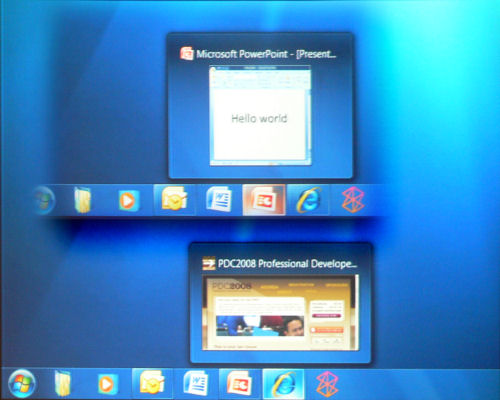
Moreau then proceeded to demonstrate what he introduced as an API for delight, including a slide showing sample code...which he then conceded to have been entirely in jest. Then instead, he showed an example video of a participant in a Microsoft focus group who spent several unprompted minutes playing with hovering the mouse pointer over the icons in a prototype of the Windows 7 taskbar, just to notice that each icon was lighting up with a different color.

One of those ideas culminated in a system where the underlying application gets to choose the color of its own halo, rather than a traditional Control Panel setting.

As Moreau explained, "We knew that, as a UI function, we needed to show some user feedback when the mouse enters the region that is a launched application icon -- that's a UI thing we had to achieve. Now, what we could've done is made it the Windows System color. That's great. But we had this sort of thing in the back of our mind -- we wanted to put smiles on people's faces. So through the course of a number of different brainstorms and explorations, the idea popped up, 'What if we let the application shine through? What if we let the application color shine through to the experience, and let it be about the application? Let's not be about Windows here.'
"So every time you hover over a launched application, you're going to get a color that's unique to that application. Now, what's going to happen is, the more you use your Windows 7 taskbar, the more applications you launch, the more windows you have running, the more color variants you're going to have along the bottom, the more beautiful your experience is going to be."
Moreau did not take questions after his session, so we didn't get a chance to ask whether his team would be task with applying similar beautification to User Account Control.