Zune Has Too Many Issues to Compete
REVIEW After watching Apple and its ubiquitous iPod dominate the digital music industry largely from the sidelines, Microsoft has decide to tackle the market leader head on with the introduction of the Zune. And the Zune player takes a lot of cues from the iPod.
Microsoft learned the hard way that the top-down symbiotic relationship between the iTunes and iPod and its benefits are what made Apple so successful. Additionally, it understood the simplicity of the device itself and its user interface were of critical importance.
Thus, a lot of the Zune is -- for lack of a better word -- copied from Apple. However, the player's few differences are where Microsoft hopes to draw in the consumer. Microsoft wants to make digital music a social experience, and these features set it apart from the crowd.
But the question remains: Is the social aspect of the Zune enough to make it a viable alternative, or is this just yet another false alarm in a string of supposed "iPod killers" that barely left a scratch on the face of the seemingly unbeatable device?
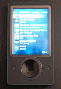
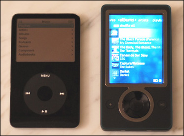
At first look, Zune looks much like the iPod, although with a larger screen and smaller scroll wheel. The problem is the "directional pad" as Microsoft likes to call it doesn't scroll at all. Instead its used more like the navigation on an old Nintendo controller.
Even though the user interface on the Zune is probably one of the best available, and better than the iPod in my opinion, it is crippled by this shortcoming. I found the directional pad not very user intuitive, initially requiring guesses as how to get the device to do what I want.
A scroll wheel here or some equal function would have really set this apart. Instead, an archaic method of navigation cheapens a beautiful UI, and that's a shame.
Other decisions, such as the blocky look of the device and its weight -- about the same as a second-generation iPod, made in 2002 -- left me thinking that while the software itself may have been carefully thought out, the hardware seemed to be rushed in an effort to get the Zune to market. A questionable decision to say the least.
 The Zune features a much larger screen than the iPod, three inches versus 2.5 inches, although both share a common resolution at 320x240. Microsoft's marketers claim the Zune's screen is better, but I could not see any appreciable difference that wasn't more a function of video encoding than display quality. Regardless, the bigger screen still made videos easier to watch - especially longer ones.
On the software side, the user interface works quite well, and album art is displayed much more prominently on the Zune screen than on the iPod. Whereas the iPod shows album covers in a small half-inch box, the cover art on the Zune takes up about 75 percent of the "now playing" screen.
There's a problem though. Microsoft isn't prepared here, and the album artwork used is resized-up, resulting in a blurred image. Apparently this is being fixed, but why not do it before you release the device?
Missing from the device UI are any extras. Only available were an FM radio, video support, pictures, and music. Compared with the iPod, it's missing podcast support, games, calendaring, notes, audiobook support, and the host of extras added with fifth-generation iPods.
I'm not sure whether this can be chalked up to the fancy transitions or less functionality requiring less memory, but one big positive for the Zune is it seemed to respond faster when loading videos, transitioning through menus, or listening to music.
Zune also seemed to perform better in producing bass then the iPod. I've noticed with the iPod that using the equalizer to produce better bass, in many tracks -- especially electronic -- distorts the response. The Zune seemed to handle this far better. I was very impressed with the overall audio quality of the Zune.
Installation of the Zune is fairly straightforward, but struck me as convoluted and unfinished. First you must go through a lengthy installation process to prepare Windows XP with the necessary drivers, which can take anywhere from 5 to 10 minutes. After that, the Zune must check for updates and download a new version of its firmware, a strange requirement for a device that just came out.
Although the firmware update went off without a hitch, as did the driver install, the process was quirky and not very user friendly, with instructions that weren't very clear.
Zune's desktop software is a mixed bag. While creating a one-stop shop for users of the device a la iTunes is a good approach, its far less functional than Apple's offering. While the software will allow you to upload pictures and videos from your own collection, there is no support to actually download them from the marketplace.
Also missing? Podcast support (getting them on to Zune is a process a bit complicated for the non-technical user) and audiobook support. The desktop interface is quite plain; in fact, I found it too simplistic. It's also still quite buggy: at one point I had to restart the software to get songs to copy to the Zune.
The Marketplace experience itself feels like a far less functional version of Microsoft's URGE service, which launched just last year. Morever, the "social" is not in effect here. Where's the functionality to send a song to another Zune user? I can't figure out what the purpose of the "Inbox" - neither on the device nor in the software.
Unlike Apple, Microsoft sells songs not by dollars but using a points system. This is an absolute joke, as the true cost of a download is masked by the fact that $1 doesn't equal 100 points. In fact, it equals about 80 points. So looking at prices, you think you're getting a better deal, but you're not. It's no cheaper than iTunes. If you're going to use "points" why not make 1 point equal 1 dollar?
After Microsoft's kowtow to Universal, one is led to wonder: is Redmond doing this to hide the oft-expressed desire by the recording industry to implement variable pricing for digital downloads?
Where URGE excels, the Zune Marketplace fails. Again, everything feels so half-baked, rushed to completion. Those switching from that music service are going to be let down, no doubt about it.
Another problem here is Microsoft's attempt to tie in other services, leaving much more chance for something to go wrong. Well, it did. I am unable to download any explicit content, and instead get an error about my family settings not allowing me to. I am the main account, and well over the age of 18.
A call to Zune Customer Service -- if you can call it that -- was a complete disaster. Not only was the outsourced representative so hard to understand I often had him repeating things three or four times, he showed a complete lack of understanding for the problem.
I don't know if I was either becoming noticeably frustrated, or he was just too unprepared, but I was transferred to another representative. She proceeded to tell me I could cancel my account and reregister. But here's the kicker: I would have forfeited my free trial.
So here I sit, with a problem that has been "escalated to Microsoft" but with no promise of a resolution, with a half-working service.
On top of this, the PlaysForSure issues are not gone with Zune DRM, I can speak on that from experience. Several times now through the main Zune Marketplace software, I've had issues with songs not playing because Zune marketplace couldn't find the rights. In the end, it's abundantly clear this software has a long, long way to go.
The Zune is a major step forward for Microsoft but it seems like the company forgot to look at (or beta test) the entire experience from the most important perspective: the consumer's.
The Good: Zune's device software and graphical user interface were well thought out, and do separate it from the iPod rather than copy it, like Creative attempted to do with the Zen Vision:M. Bravo to Microsoft on this.
The Bad: It's clear Microsoft rushed the Zune out of the gate in an attempt to get it out for the holidays. The design of the unit just feels very unrefined, prototype-like almost. What does Apple know that Microsoft didn't which causes the device to be almost twice as thick? I also don't understand the decision to release the Zune Marketplace with just audio support after touting video as a major feature of the player. Add on top of this the issues with the store and software itself, and the whole Zune experience somewhat of a letdown.
The Bottom Line: I cannot in good faith recommend this product in its current form to anyone also considering an iPod. Those averse to Apple products and looking for a new Windows-only player should definitely consider the Zune, but understand there are quite a few kinks Microsoft has left to work out. All in all, the Zune is a disappointment. A moral victory for Microsoft, yes. An iPod killer? Absolutely not.
Microsoft's Zune and Apple's 30GB iPod side by side:

