GNOME 40 Linux desktop environment is here

Just yesterday, we told you that Fedora 34 Beta was released, and it was notable for using the upcoming GNOME 40 desktop environment. Well, I have great news Linux fans -- today GNOME 40 is officially released, and yes, it will be used in the eventual stable version of Fedora 34.
But yo, wait, hold on, why is the newest version of GNOME being designated as 40? Wasn't the previous version 3.38? Yeah, that is factual, but no, the developers haven't gone crazy. Actually, as we told you last year, GNOME has a new versioning scheme. It is, understandably, a bit confusing to jump from 3.x to 40, but that's what it is, folks! You know what though? Who cares what it's called as long as it remains great. And once again, it looks to be.
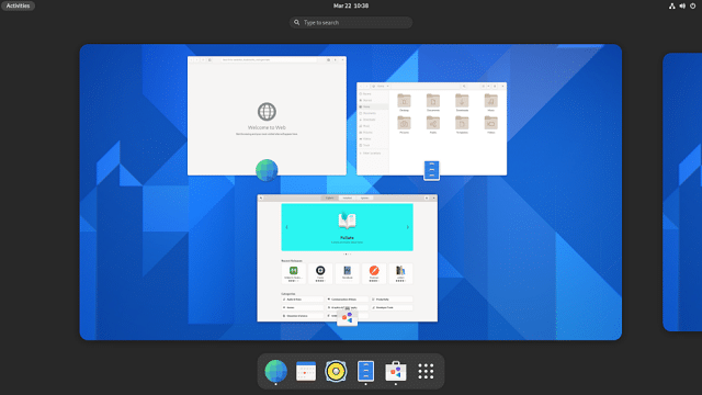
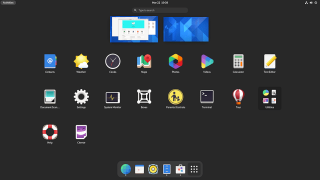
GNOME 40 is the most exciting version of the desktop environment in years, and it has definitely earned its massive version number jump. GNOME 40 is most notable for having a horizontal workspace switcher and having the Dash (favorites launcher) moved to the bottom of the screen. These may sound like small changes, but they are quite significant to regular GNOME users, and there will undoubtedly be a learning curve.
Of course, those are not the only new things. In fact, the GNOME developers brag that there are a monstrous 2,457 changes in the desktop environment. For example, there are new multi-touch Touchpad gestures, a redesigned Weather application, and improved tabs in the Web (web browser) app. The settings app has been slightly refreshed to move some option around for a more intuitive experience. And yes, Software has been updated too.
"Software has had a number of improvements for GNOME 40. The large application banners have a new and improved look, and now cycle automatically. New version history dialogs display the recent changes for each application, the updates logic has been updated to reduce the frequency of reminders. Be it Flatpak or distribution packages, GNOME Software now tells you where you’re installing your software from. Some work happened behind the scenes to improve how Software presents information about new packages," explains The GNOME Project.

The developers share other significant changes below.
- Maps has new information popups for locations, showing information from Wikipedia, as well as native location names. It is also more adaptive, making it possible to use it at a range of sizes.
- The interface for using the Compose Key has been improved: Compose sequences are shown as they are being entered. Dead keys are handled in a similar way, too.
- Many of GNOME’s apps have visual updates for GNOME 40, with rounded window corners and lists and new-style view switchers. Affected apps include Files, Web, Disks, Fonts, Calendar, Photos and System Monitor.
- The Document Viewer sidebar displays paired thumbnails when the main view is in side-by-side mode.
- GNOME’s visual style has got smoother and more polished. Sharp edges have been rounded, strong borders have been smoothed out, sidebar styling has been unified and toned down. Scrollbars are now slightly bigger when used as a control.
Unfortunately, While GNOME 40 was technically released today, most people cannot really run it just yet. As is typical, you will have to wait for your favorite Linux distribution to provide it to you. Yeah, waiting stinks, but if you really want to check it out today, I would recommend running Fedora 34 in a virtual machine in the interim.
