Amazon fixed one of the most broken things about Kindle Fire, now it needs to fix the rest

For a platform that was built to handle text documents, Amazon Kindle's support for non Kindle-formatted files has been nothing short of atrocious.
Wirelessly sending documents to a Kindle required that they be emailed to a Kindle email address where they'd be converted and sent to the user's Kindle library; or they could be uploaded directly to Kindle e-readers or tablets via USB, but with spotty usability.
In the case of PDF files, this often meant lost pagination, no text search, and no interactivity (read: highlighting.) It was a generally unpleasant experience to get outside content into the Kindle library, and then consuming it was another unpleasant experience.
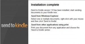
Yesterday, Amazon took a major stride in remedying this messy situation, and released the "Send to Kindle" application for Windows/Mac. This desktop application dramatically streamlines the process of uploading new content onto Kindle devices.

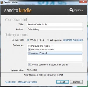
On Windows machines, you can simply right-click on a document (word, text, rtf, image, pdf, and others) and click "Send to Kindle," on Mac machines, you can drag the file you want to send to the "Send to Kindle" icon in the dock. On all systems, a menu then pops up to let you select which registered Kindle device to send the document to, including mobile applications for phones and tablets. They can be sent to any combination of your devices, all of them, none of them, whatever.
I am an Android user. Not a die-hard, not a fanatic who walks around in a little green bugdroid beanie, but someone who uses Android because it is customizable and versatile.
I am also one of those people who does not believe there is a "winner" among Android tablets; a device that can be everything to everybody like the iPad manages to be.
That being said, the Kindle Fire is now the closest Android Tablet of any to reaching that ideal. Amazon just needs to fix a few things.
Kindle Fire's branch of Android is based entirely around Amazon's retail ecosystem and giving customers various ways to interact with their purchased content, or to purchase more content. It's good, but it fails in two respects.
Compatibility
The Kindle Fire allows applications available from third-party sources to be installed, but with the new Send to Kindle application, we see how hostile Amazon remains toward content from outside of its ecosystem.

Users can send the following formats to their Kindle: .DOCX, .DOC, .TXT, .RTF,
.JPEG, .JPG, .GIF (not animated), .PNG, .BMP, and .PDF. For books, I've found that the application actually does support the transfer of .mobi e-books, but it does not accept the extremely common .epub (archived HTML/XHTML), or protected .pdf e-book formats. Audio and Movie files are bounced right out of the application.
For as easy as Amazon has made file transfer, it still has not made compatibility any broader.
Interface
The Kindle Fire UI, generally speaking, is horrid.
I'm talking about the "carousel" view of recent processes which dominates the home screen. It is constantly changing based upon whatever apps or content you most recently interacted with, and when your device is full of various documents without a cover image, your homescreen becomes a big Rolodex of white cards.
Whenever you add a new book or application, it slides into the first position in the carousel and is the first thing you then see on the homescreen, irrespective of where you actually want it to go.
The constant aspect of the homescreen UI is the top navigation bar, which contains buttons for Newsstand (Kindle periodicals), Books (Kindle e-books), Music (Amazon mp3), Video (Video on Demand/Prime), Docs, Apps, and Web (Silk Web browser).
Until yesterday, when Amazon released Send to Kindle, the "Docs" tab on my Kindle Fire had never been used because the method for populating it was so unwieldy. I have had several directories of e-books and magazines that I had gotten through various non-Amazon channels that didn't make it to my Kindle Fire for this very reason.
Now that the document sharing aspect has been simplified, the docs directory is full, but only of the things that Amazon supports.
If document compatibility is improved, and the UI is fixed, there is no reason why the Kindle Fire couldn't be the banner iPad competitor.