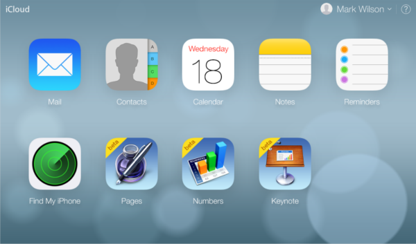
Apple gives iCloud.com an iOS 7 makeover

Today is iOS 7 day! But there is more than just a new operating system for your iPhone, iPad and iPod to look forward to; Apple also has a redesigned iCloud website for you to use. Unsurprisingly the new design takes heavy inspiration from the look of iOS 7, mimicking the floaty, layered styling that graces the new mobile OS.
Log into your account and you'll immediately be greeted by a muted, blurry background, over the top of which various icons appear to float. Apps including Mail, Contacts, Calendar, Notes, Reminders and Find My iPhone all now sport the iOS 7 look, but the beta editions of Pages, Numbers and Keynote retain their older design. It looks as though there might still be a little work to do -- not all icons have been redesigned, for instance.
There have been a lot of redesigns in the tech world recently. Google's flat logo is appearing on its sites for many people, Yahoo has a new logo, and Bing just revealed a new look for its news site as well as a new logo. With iOS 7 being such a radical departure from the previous versions of the OS, it makes perfect sense for Apple to give the rest of the product line a similar feel.
If you’re keen to try things out, you may have to wait for a bit as iCloud appears to be groaning under the weight of traffic as millions of iOS users back up their data in preparation for the big upgrade.
What do you think of the new design for iCloud?