Switching from a Windows 8.1 PC to Mac -- a painful yet worthwhile transition

Due to my geeky nature I am prone to making rash decisions. If something interesting grabs my attention chances are I will want to try it out right away, without giving too much thought to the possible implications as curiosity gets the best of me. More often than not (luckily), I enjoy the experience from the get-go and end up accepting the new, but this has not been the case with my switch from Windows 8.1 to Mac. Things just did not make sense to me right from the start, it did not feel natural and it did not just work. I have since wanted to go back more times than I can remember.
Years and years of muscle memory and computing habits, that I developed whilst using Windows, went down the drain as I started my Mac experiment (a costly one at that). Bye, bye! The software that I needed or wanted to use was simply not there, or working as I would have liked it to, on OS X. I definitely did not enjoy this part, nor the one where I had to find good alternatives to my favorite programs, learn how to do basic things again, and adapt to what was basically a quirky new platform for me. I am not a masochist, I enjoy trying out new things, but even I had to admit that I was in over my head.
Sexy Hardware
I did not regret getting a 2013 MacBook Air as much as I regretted using OS X instead of Windows 8.1. The hardware is great, and there is little that can be faulted in this department. Perhaps the display is not as sharp as it could be -- after all, a resolution of 1440 by 900 is low even by Apple's own standards -- and the number of available expansion ports is lower than I would like it to be (then again, I should have probably gotten a MacBook Pro instead), but the keyboard is better than anything I have ever used before (after getting used to it) and the battery life is simply amazing for a device this thin and light.
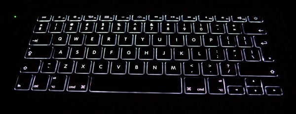
The keyboard layout confused me for a while, as there was no Delete key like my old laptop had on its keyboard. Pressing Fn + Backspace instead felt strange, but I got used to it. I even got used to the new keyboard shortcuts, that make heavy use of the Command key instead of the Control key that is required by similar actions on Windows. Whenever I am using my old laptop I want to press Command + C to copy stuff, and instead end up triggering the start screen in Windows 8.1 (as I press Windows key + C instead). Ergonomically speaking, Apple's way is better for me; it took me a while to figure that one out. (In my case I was not forced to go back and forth from Windows to OS X, but a friend of mine tells me he is having trouble adjusting to the keyboard shortcuts on his MacBook Pro because of this.)

If you plan on buying a Mac my advice is to think really hard at what you are going to subject it to. If you want to attach more than one external monitor or need more than two built-in USB ports the best course of action is to look at a 13-inch MacBook Pro or larger (or iMac). Same thing if you want to use heavy-duty software -- either in OS X or any Windows version. It is not that the MacBook Air cannot get the job done (well, it can't if you want two external displays), but it will take longer to do it than on a more powerful machine.
On my base 13-inch 2013 MacBook Air I can use virtualization software whenever I need it, but it works well only for lighter tasks. I would not like to power up Photoshop, for instance, in Windows 8.1 while the operating system is virtualized. Also, keep in mind that the awesome touchpad -- if the Mac you want offers one -- works best in OS X, with lots of gestures missing in Windows 8.1. Similarly, OS X relies on gestures to get things done quickly (like triggering the notifications panel) so you might want to get a touch-friendly peripheral -- if the Mac you want does not offer one -- to get the best of it.
The Windows 8.1 Withdrawal Period
As I explained at the beginning of this story, OS X is where things went sideways. The way things are done in OS X is different compared to Windows, especially Windows 8.1. Sure, they are pretty much the same in some regards -- both have a control panel (called System Preferences in OS X and Control Panel in Windows), a desktop and taskbar, and other similar features -- but fundamental actions, like copying, pasting or deleting apps, are performed in different ways or with different keyboard shortcuts.
Take deleting apps for instance. In Windows, most, if not all, apps have an uninstall option found in their Start menu folder. If it is not there, the option is always available in Control Panel. On OS X, however, you delete the app from the Applications folder and that is basically it (a completely clean uninstall might involve removing other files as well, but that is the main idea).
What I could not move past is the way OS X maximizes (or, better said, enlarges) windows. When pressing the "+" button instead of taking up all the available space, the window is enlarged depending on the size of the content that it displays. For instance, if the content fits on half the screen that is the size that it will be "maximized" to. The problem is that this behavior is not consistent, as some apps refuse to make their window bigger.
Also, there is no window snap, like there is on newer versions of Windows. If I want to work with two windows side by side I have to manually position them, or pay for an app -- that is usually expensive, from my point of view, for what it does -- that can offer the feature (I like Cinch, that I paid $7 for). This also fixes the window maximizing issue. Some may shy away from saying this, but Windows is more advanced, and better, in some ways than OS X -- and this is one of those areas.
A small but annoying problem that I encountered more recently was with the way OS X handles network drives. I have a 4 TB NAS, which Windows 8.1 would normally be able to connect to automatically at each login (after mounting the folders for the first time). Not OS X though. I later learned that I can set my user to automatically mount volumes after logging in, by going to the Users & Groups menu in System Preferences then Login Items and manually adding what I need there. Seems more of hassle than it should be, as the way this can be done is not obvious to someone like me who just switched from Windows.
I have heard the "just works" tagline for Macs countless times before and, after using one for a while, I am tempted to say the name of an animal combined with something else, in a single word, every time I see it again without any relatable context. It just does not all the time. Everything involves a (steep) learning curve, and Macs are no different.
Speaking of my NAS, I have lots of movies and TV shows stored on it. On Windows 8.1 I would use Media Player Classic Home Cinema to watch them. It supports every format I can think of, can be used to find and download subtitles and offers plenty of configuration options. As far as I am concerned there is nothing better. But it is not available on OS X, where I have to settle for VLC which, by comparison, is crap.
I had no idea why videos would randomly stop playing from the NAS, only to discover some very well hidden caching options for network playback (after researching why it did not work right, with various solutions offered by others who have been in my shoes). It also fails to go into full screen mode properly on my external display, often having to exit and enter full screen mode countless times just to make the gray menu bar disappear (it is darn frustrating). I have been looking for better alternatives since, only to find none that works better on OS X 10.9 Mavericks.
Office 2013 is also miles better, usability-wise, than Office 2011, the latter of which is the only choice on Macs. I'd much rather use Windows 8.1 in Boot Camp -- which I would rather avoid, as you may know if you have read my previous stories -- to run the latest version of the suite. It looks more modern, has more apps included and is updated for more recent versions of Windows, whereas the Mac counterpart was meant to run on OS X 10.6 Snow Leopard (which is more than three years old now). The obvious solution is to use Windows, either in Boot Camp or a virtual machine. There is no substitute, really. Hopefully, Microsoft will launch Office 2014 this year (it is about time) which will fix everything that's wrong with the old version, including the dated design that makes me feel like I am living in the 2000s.
Coming Around

So far, I have only listed issues encountered with OS X and OS X apps (and there are more, but you get the gist). But there is also software for Mac that works very well, and may not be available on Windows. A good example is the official Twitter app (yes, there is one for desktops), which looks nice and works great and, ironically given the market share discrepancy, is not available as a desktop Windows app.
There is also built-in social network integration, with sharing from the notifications panel, which I use when I want to post an update (mostly on Twitter and rarely on Facebook). Windows 8.x has a similar feature, but it is nowhere near as quick to access, or as conveniently placed, and you'd be better off by powering up the dedicated apps anyway. No matter how much Microsoft would like to avoid adding a notifications panel in Windows 8.1 (even though there is little proof that live tiles are more effective or better than one), there is no denying the fact that it is an instrumental tool for productivity.
There is one on OS X and it makes my life so much easier -- it can be triggered by a two-finger swipe or click on a button -- as it shows everything that happened since I last used my Mac, all in one place. If I have new messages from my fellow colleagues, on our group chat service, I can see them there. Same goes with emails, tweets mentioning me, Facebook messages, the new song that is playing on iTunes Radio, messages in iMessage and so on. I just glance at it then read everything I need to know without digging through dozens of apps or live tiles, like Windows 8.x forces me to. This alone is enough to keep me a happy OS X camper, despite the said shortcomings. The notifications counter under each Dock icon complements this feature, and adds to the increase in productivity.
Another example of a lovely OS X feature is Tags. They can be assigned to files and folders, including ones stored on external or network drives. Because tags is a color-based system, it makes it easier to visually differentiate files. I have different colors assigned for movies and TV shows I already watched (red) and have not watched yet (green; I also use gray for ones that are not a priority) and TV shows my girlfriend likes, but I do not (purple). It makes finding certain items in lists much more effective and less frustrating. It also spares me the (minor) effort of moving files into folders, as an alternate sorting method.
The option to use apps in full screen mode is also welcome, but the implementation (refined in OS X 10.9 Mavericks) is even better. Full-screen apps automatically go in the foreground, but with a three-finger swipe on the touchpad the user can switch back to the desktop (each full screen app gets its own space, under the monitor it runs on). Practically, I can have a movie running, pause it, switch to the desktop to write something in Chrome, switch back to the movie and resume playback, smoothly without having to minimize anything or switch to a different app. Now this is something that just works, as of the latest OS X release.
Better For Me, Maybe Better For You Too?
 I have since decided to give Windows 8.1 another chance on my MacBook Air as I wanted to see whether it would be better for work. I installed it, configured it, installed a couple of big apps (like Office 2013) and was pleased with it for a while. I switched back to OS X though because live tiles did not work for me, the touchpad wasn't as gesture-friendly as it is in Mavericks and, surprisingly, I was actually better served by OS X for all my other needs.
This has lead me to write this story, and realize that, given enough time for accommodation, it can give even longtime Windows users like me the experience they were looking for.
The group chat service we use at BetaNews, for instance, prioritizes Mac development over Windows (and iOS over Android), so I am better served by a Mac in this case. The major browsers are pretty much the same on all platforms today, with any differences likely attributable to specific operating system features.
Inexperienced computer users would also be served better by Macs, as every piece of popular software that I have tried so far did not try to trick me into installing a toolbar or changing my preferred search engine. That is actually refreshing to see, as I do not have to pay close attention to every checkbox, dialog and window that appears (on OS X, in most cases, a simple drag and drop of the app into the Applications folder installs it, which is simple to understand for everyone involved).
Best of all, my Mac experiment gave me a different perspective on both Windows 8.1 and OS X, their strengths and weaknesses and the quality of the software that is available on the two platforms. Obviously, those who are hardcore Windows users will probably tell me that they cannot (or will not) do the same based on their (very specific) needs, but then not everyone's workload involves Windows-exclusive software (that most people will not run anyway).
Photo Credit: Andresr/Shutterstock