OneNote for OS X is nice, but Evernote's better [Review]

For jotting down digital notes, I prefer Evernote over any other app, including Google Keep and Microsoft OneNote. The main thing I like about it is the superb platform availability that allows me to use the service on every laptop, smartphone and tablet that I own. The sharing feature is also great; my girlfriend and I can seamlessly share and edit each other's notes and notebooks.
While Google Keep is not yet a strong contender for me, OneNote can be as good as Evernote. Some would argue it is even better. Because both my girlfriend and I use Windows Phone 8 smartphones, Microsoft's app would appear to be a natural choice. But, the lack of support for OS X means OneNote is a no-go, as I cannot use it on my MacBook Air. Until now.
As you may know by now, Microsoft just launched OneNote for OS X, and for free! The app is now free on Windows as well, complementing the existing Modern UI offering and the full-blown OneNote that is part of Office.
As a result, I can now use OneNote on every device I own. So, I have decided to give it a chance on my MacBook Air to see if it is good enough to actually replace Evernote.
Hey, Gorgeous!
Straight off the bat, I have to say the design of OneNote for OS X is impressive. The app looks clean, easy to use and is enticing enough to use for a prolonged period of time (unlike Office 2011 for Mac, which is stuck in... well, 2010 -- when it was released).
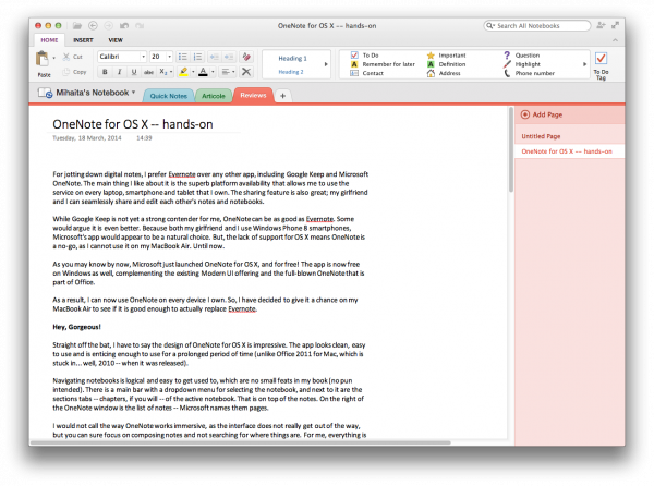
Navigating notebooks is logical and easy to get used to, which are no small feats in my book (no pun intended). There is a main bar with a dropdown menu for selecting the notebook, and next to it are the sections tabs -- chapters, if you will -- of the active notebook. That is on top of the notes. On the right of the OneNote window is the list of notes -- Microsoft names them pages.
I would not call the way OneNote works immersive, as the interface does not really get out of the way, but you can sure focus on composing notes and not searching for where things are. For me, everything is laid out in a logical manner. I even prefer it to Evernote's layout, which is not as well designed; it feels more cumbersome.
Features?
The tabbed layout that Microsoft introduced in Office 2007 (and in later versions of the suite) is used in OneNote for OS X as well. There are just three tabs in the first release, which take you to the Home, Insert and View menus. As the tabs are the gateway to OneNote's features, I have decided to discuss them in a separate section, to focus more on what they bring to the table.
Home is the default tab. It provides easy access to commonly-used settings like the font type and size, headings, tags as well as copy and paste. The icons are intuitive enough for someone who has used Microsoft Office or similar products. In my case, I could immediately adjust to them.
Tags is one of the most interesting features -- well, more so than the font size and type menu -- OneNote offers. Microsoft includes quite a few of them, pre-defined, which can be used to (obviously) tag bits of the note, like phone numbers and contact names. The tag is indicated by a small pictogram to the left of the text.
Insert is the tab which provides access to a table creator, inserting photos, date, and date and time indicators. Lastly, View reveals the controls for zooming and a page color menu. Nothing fancy here, but also nothing that is difficult to understand and use.
That's It?
This is pretty much what every OneNote user will see in the OS X app, at least in this release. I have no doubt Microsoft will add features in the future, to better match what Evernote tots on the platform. There is also another part of OneNote, which I have yet to mention.
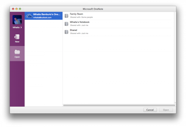
OneNote for OS X, like its siblings on other platforms, integrates with the note-taking service Microsoft includes in OneDrive. So, if you use the company's cloud storage service for notes, that content will also be available in the OS X app, if you choose to log in with the respective Microsoft account. This is what makes OneNote -- and other similar apps -- a powerful tool. It all sounds lovely so far.
But...
Here is what I do not like. First off, I cannot fathom why the notebook management feature is so poor. Evernote handles this infinitely better, by comparison. As appealing the design of the app is, as terrible this feature is implemented.

I can create a notebook and share a link to it, but I cannot manage the sharing settings from within the app. I can also create a notebook, but I cannot delete it. These are puzzling choices. If Microsoft wants to compete with OneNote it has to do better than this, and quickly, because I see no reason why someone would want to switch to a lesser app, just for the design alone.
Another issue with OneNote is that Family Room support -- a feature in Windows Phone, which lets users share notes, location, photos and other things -- is also not properly implemented. The person who created Family Room can edit notes from the app, but those who were invited to join cannot. It simply does not augment a feature Microsoft has in its smartphone OS, which is more than silly if you ask me.
I Still Prefer Evernote
Like I said in the beginning of this hands-on, one of the things I like most about Evernote is the way it handles sharing. The app is designed, from the ground-up, with collaboration in mind, which is something Microsoft has yet to properly bring to OneNote. This is the reason why, even though I adore the design, OneNote is still not an option for me (coupled with the inability to easily delete notebooks). It also does not add anything that Evernote does not have, in some form or another.
This should not detract from the app's merits, however. If you are the sort of person who just wants to write notes, and does not care much about the downsides I detailed, OneNote is more pleasant to use than Evernote and, in my opinion, a better choice in this case. I just wish Microsoft would have gotten it right straight off the bat, and made it better for more people.