Microsoft shows off Office for Windows 10 and reveals Office 2016 plans

Microsoft told us a lot about Windows 10 yesterday (it's free!), as well as the future direction of some other interesting projects such as HoloLens and the Spartan browser. We did get a brief glimpse at the touch-friendly versions of Office apps for Windows 10, but today Microsoft also reveals more about the next desktop release -- Office 2016.
In keeping with Microsoft's latest vision, the focus with Office moving forward is "mobile-first, cloud-first". We'll be able to try out Office for Windows 10 very soon as the universal apps are due for release for Windows 10 Technical Preview very soon, and the final version will be pre-installed -- for free -- on phones and small tablets. Some of this we knew yesterday, but talk of Office 2016 is new!
Perhaps the first question that Office users will have is "when will Office 2016 be released". Obviously it's very early days at the moment and a precise date hasn't been pinned down, but Microsoft has pencilled in some time in the second half of 2015 -- so anything from five to 11 months away.
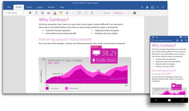
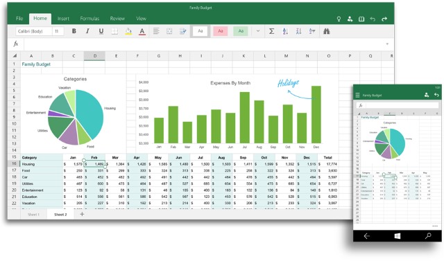
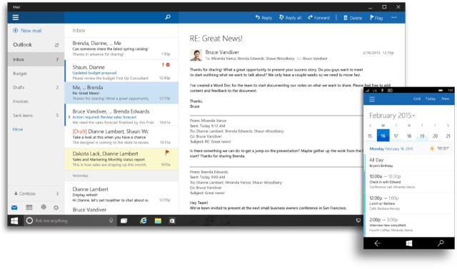
But the next big release for Office is Office for Windows 10, and over on the Office Blog, the Office Product Management team's general manager Julia White shared a series of screenshots showing off the applications. As these are touch apps designed with smaller screens in mind, it should come as little surprise that the interfaces are noticeably cleaner than those currently found in full-blown Office.
Word (pictured above) takes elements of Office 365, but gives them an even more modern twist. A dedicated Read mode strips things back even further for distraction-free reading. Excel (pictured below) boasts a similar look, and White claims that "new touch-first controls shine in Excel, you won’t even miss your keyboard and mouse when selecting ranges of cells, formatting your pie charts or managing your workbooks".

OneNote looks like it has undergone the biggest cleanup; a tabbed interface makes it possible to store a wealth of data in a relative small space. Outlook Mail and Outlook Calendar for Windows 10 (below) draws heavy inspiration from the look of Outlook.com, and this will help to make the transition from web to app easier for people to bear.

Although it's still not clear exactly when we'll be able to try out Office for Windows 10 for ourselves, things seem to be shaping up very nicely. In the meantime, you can check out the video below to see the software in action, and the Office blog for more screenshots.