Is LibreOffice 4.4 the 'most beautiful' ever?

The Document Foundation has unveiled LibreOffice 4.4, describing it as "the most beautiful LibreOffice ever".
But while there are plenty of visual tweaks (an enhanced Sifr monochrome icon theme is now the default on OS X), most of the UI improvements are about usability.
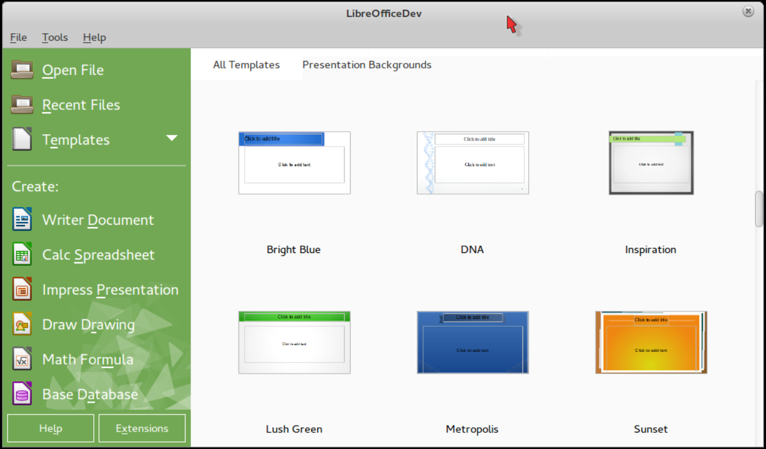
The Start Center now displays templates (including some new ones), toolbars have been reorganized for faster navigation, Writer’s status bar is easier to read, Impress master elements can be removed directly from the Master View preview, menus have been optimized and rulers enhanced.
Improved file format support means metadata is now imported from MS Publisher, Abiword PPTX, VSD and VSDX; Publisher tables and embedded fonts are now imported; there’s new support for opening Adobe PageMaker files (v. 6-7), MacDraw, MacDraw II and RagTime for Mac (v. 2-3), and Sony BroadBand eBook (LRF) files.
The Insert > Audio/ Video command now supports Real Audio (.ra), Real Media (.rm), Digital Video (.dv), Audio Codec (.ac3), Ogg Opus (.opus), Advanced Systems (.asf) and MPEG Audio files.
Other significant improvements scattered around the suite include OpenGL transitions, digital signing of exported PDFs, password protection for Impress/ Draw files, Math support for the basic 16 HTML colors, PNG-24 use for document thumbnails (they’re 66 percent smaller on average), and a smarter color selector which shows recently used colors.
We’re not sure that it’s the "most beautiful" release ever, but LibreOffice 4.4 still seems like a great release to us. Go take a look.