Meet Google Nexus 7, Kindle Killer
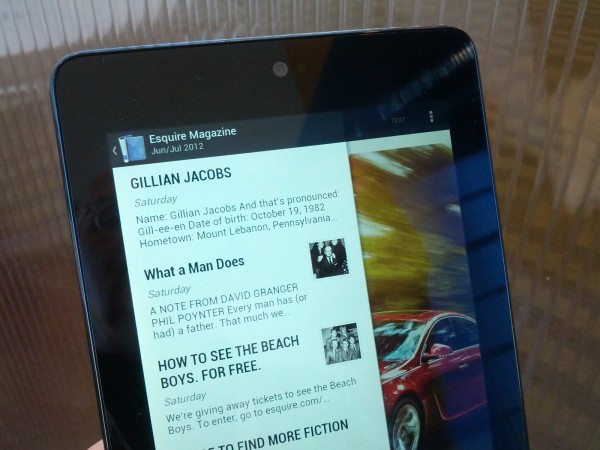
I told you so, in April. Contrary to pundits at the time viewing Google's tablet as an iPad competitor, I saw something else: Google isn't gunning for Apple but Amazon. After getting my hands on the tablet this evening, and comparing the experience using my wife's Kindle Fire, there is no doubt. Google will probably save Android from Amazon, but the end cost may be greater gains for iPad.
By just about every measure -- the exception being buying tens of thousands of retail goods -- using Nexus 7 feels like Kindle Fire, only better in every way. Significantly, the experience is different from using Google Nexus smartphones or other Android tablets. That's because Google Play is so visible. I can't say if that's a function of Android 4.1 Jellybean or how Google has set up the tablet. But content pushes to the forefront, like Kindle Fire, and much of it is similar.
Make no mistake, Nexus 7 is all about content consumption, much the same way as Amazon's tablet and also iPad. Google offers a curated stack that feels end to end. Like Kindle Fire, also iPad, users can read books and magazines, watch movies and TV shows and listen to music. Sure other Android tablets can do these same things, but it's how that matters -- all coming from a single cloud store. Also, the different sections, say for movies or newspapers, feel much like using Amazon's store. If I wasn't at Google I/O, and so home, I would take screenshots of my wife's Kindle Fire and show the similarities.
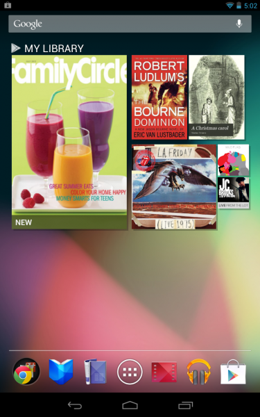
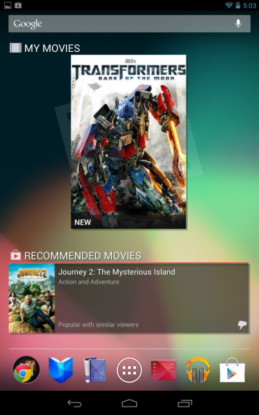
In the default setup, the main screens fill with Google Play content, one of these on separate screens: My Books/My Magazines, My Library, My Movies and My Music. Boundaries between device and content blur, and the approach is closer to Chromebook than any Android tablet. Nexus 7 is your life in a cloud device. Sure you access local content, but like Kindle Fire there is seamless integration with cloud content and device.
Let's compare to see how much Nexus 7 is meant to compete with Kindlfe Fire:
- They're about the same physical size with 7-inches displays.
- Resolution is roughly comparable 1280 x 800, but Nexus 7's IPS display looks better.
- Kindle Fire runs Android 2.3 and Google's tablet v4.1, and there is no comparison; Nexus 7 is smoother and lusher in every way.
- 8GB storage is same, at $199, but Google offers 16GB for $50 more.
- Nexus 7 has 1.2-megapixel front-facing camera; Kindle Fire none.
- Google's tablet has WiFi and Bluetooth; the latter is missing on Amazon's device.
- The newer Android has Tegra 3 quad-core processor (let's just not talk about the other).
- Amazon offers its own Silk browser, which uses a unique server-caching system; Google serves up Chrome.
Then there is the similar curated cloud content services and ways they feel alike.
In raw performance and fluidity, Nexus 7 is nothing like Kindle Fire, or any other Android tablet I've used. Actually, performance feels very much like Galaxy Nexus, which is another Google branded, co-designed device (this time with Samsung). Until today, Galaxy Nexus was by far the best Android device I've ever used. The responsiveness of the touchscreen and overall using apps is very similar, and that's with different operating systems. My Galaxy Nexus has Android 4.0.4 Ice Cream Sandwich.

This is one smooth performer, and I'm baffled by how much better than my Transformer Pad 300, which Asus also makes. Actually, I'll sell the Transformer soon after returning home, and I bought it for the quad-core processor and stock Android. Nexus 7 is so much better.
But there's a problem. The user experience is so good -- and in ways oh-so like Galaxy Nexus -- I look at the two and wonder why have both of them. The 7-inch tablet doesn't feel that much larger than Galaxy Nexus' 4.65 display.
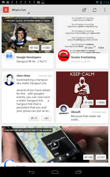
Something else: Google goes where neither Apple nor Amazon can. Google+ is a huge differentiator and topic too big for this post. But briefly -- the social network and the many Jellybean enhancements that respond to your behavior and habits. The device is primed for the two Google+ killer features, Hangouts and the new Events. As for Android 4.1, multiple features, including revamped Notifications and new voice response, make the OS more of a personal assistant -- and by demo much stronger than Apple's Siri. But that's all topic for another day.

In April I identified six things I expected Google's tablet to bear -- and they mostly related to killing Kindle Fire: Brand equity, $199 price, superior operating system, curated lifestyle apps, deep cloud service integration, and reference design for other Android licensees to follow. I see these all here. What I didn't anticipate: How closely Google imitates and exceeds the Kindle Fire curated apps, browser, operating system and services experiences.
Nexus 7 is available now for preorder from Google Play. There's good chance I'll replace my wife's Kindle Fire with one very soon, and she loves that device. According to my buying poll, 47 percent of you plan to buy Nexus 7 within the first month of release and another 18 percent in three months. Is that Kindle killing or what?
But is it enough to take out iPad? Not that I see. Nexus 7 success will prevent the Android tablet market from fracturing around specialized versions, like Amazon and Barnes & Noble offer. But the device is more likely to take away sales from these Android adaptations rather than from iPad. Six months from now? Who knows? If you think you do, please pontificate in comments.
