HTC Windows Phone 8X -- positive first impressions
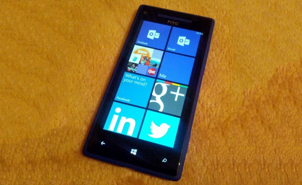
Before anyone labels me as an Android fanboy, let me tell you this -- I like Windows Phone 8, I like it a lot. Even though my smartphone of choice is the Google Galaxy Nexus running either of the two Jelly Bean iterations, Microsoft's mobile operating system has always appealed to me, especially the latest iteration which is by far the best of the bunch. I’ve always wanted to review Windows Phone 8, but there was one big problem -- I couldn't get a review unit for an in-depth look at it. So I did what PR folks were not expecting -- I bought an HTC Windows Phone 8X.
So why the Windows Phone 8X? There are not many devices running the new OS at the moment, but in my part of the world the selection is even more limited -- HTC is the only manufacturer that currently sells a Windows Phone 8 smartphone. The price is also very attractive at EUR479 which is marginally less than what the Samsung Galaxy S III goes for, for instance. By contrast the Nokia Lumia 920, which is not yet available locally through official channels, costs more than EUR700 at major retailers, a price difference that I cannot justify at all. So, as you can imagine, the Windows Phone 8X is my one and only choice.
 Both HTC's device and Windows Phone 8 arrive with a clean slate in my hands -- I have not owned or used either of the two before. But my brief previous encounters with the Taiwanese manufacturer's devices, as well past iterations of Microsoft's operating system, meant I had high expectations of quality and a smooth user experience.
Build Quality Issues
Let's focus on the bad points first. HTC may know which materials should be used to manufacture a quality device, but the company appears to have put little-to-no effort into figuring out how and where to place the physical controls. Button placement is extremely important, especially to someone coming from an Android device.
The first issue concerns the power/sleep button which is placed on the top right side of the Windows Phone 8X. Not only does it make unlocking the phone rather difficult since it's a tall device, but it also feels like a chore to find (because it sits flush with the case) and press (because it's so stiff). It's one of the poorer aspects of using a Windows Phone 8X, and constantly noticeable in daily use.
The volume keys also sit flush with the case and are placed on the upper right side of the device, so no matter if I want to unlock the phone with my right or my left hand I always press one while doing it. There's really no escape from touching the volume keys most of the time, because a firm grip is needed to press the button and not have the phone slide from under my fingers. And the side under the button creaks under pressure, because of a lack of strengthening inside the case most likely.
The Good Build Quality Bits
The only good bit about the physical controls is the two-stage camera button which works great, although I often press it when taking the Windows Phone 8X out of my pocket. That said, it's quite nice to have a real button that I can press to autofocus and take a picture without touching the screen, but there's also more to go wrong with it, potentially.
Right, that’s the negative bits out of the way.
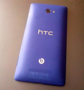 The back case is made of plastic, but oh my does it feel great to the touch. It puts all Samsung devices that I’ve used in the past (or still use) to shame, including the Galaxy Nexus, Galaxy S III and Galaxy Note II, to name a few. The coating feels smooth, like some sort of fabric yet more durable, and is stiff enough to not creak under pressure. My Windows Phone 8X is the California Blue (purple) model, so it really stands out among its peers.
Even though it measures 10.12 mm in thickness, the Windows Phone 8X does not appear anywhere as bulky as its waistline may suggest. The tapered edges disguise the significant thickness and make the phone feel great in the hand, which is what ultimately matters. I don't even notice it in my pockets. By comparison, the Galaxy Nexus is much thicker at the bottom despite Samsung claiming an 8.9 mm measurement and feels much bulkier as well.
You Look Great On That Screen
The screen is really amazing. It's a 4.3-inch Super LCD 2 panel with a resolution of 1280 by 720, one of the standout features of the Windows Phone 8X in terms of sheer specifications. Text looks great, which it should considering the high 342 ppi density, but what's more important is the image quality looks great at low brightness as well, unlike my Android device. I really can't emphasize that enough, it just looks stunning.
My first thought when I planned to buy the Windows Phone 8X was that the display would feel too small. On the contrary, it's just as tall as the one on the Galaxy Nexus, minus the on-screen buttons, and only slightly narrower. Seeing as how the smartphone industry is moving towards building ever larger devices, it's refreshing to see HTC did not follow the trend with the Windows Phone 8X. Using it with one hand is perfectly manageable -- as long as you can unlock it.
Hello Windows Phone 8
 Even though I liked the idea of Windows Phone 8 I’d never actually used it before purchasing the Windows Phone 8X, except for a few minutes in the store. Based on my experience with Android and iOS on smartphones, I prepared myself for the likely scenario that Microsoft's operating system would not be as good, to put it kindly. My worst fear was the limited app selection and the rather limited use of tiles.
But I have to hand it to Microsoft, using Windows Phone 8 is a smooth experience. Unlike Android, and even iOS at times, Windows Phone 8 feels fluid across the board with no discernible lag or stutters when scrolling through the user interface, loading and uninstalling apps, switching between apps, and so on. Android on the Galaxy Nexus and Galaxy S III does not even come close, based on my experience. iOS isn’t far off, but really how difficult is it to render icons?
The app selection is indeed limited, but doing some searches, and with some help from folks on Google+ and forums, I quickly found most of the apps that I need. It's no App Store or Play Store but it does the job for me, which I found surprising. Truth be told, the only app that I really miss is Google+, which at the moment is only a mobile view affair thanks to Google's lack of commitment to Windows Phone 8 users.
However a skill that Google and Android app developers have yet to master is making an operating system and applications look great. Windows Phone 8 is gorgeous and all the apps that I’ve tried so far (except those which display a mobile view of a website) look amazing. By contrast Android developers appear to find user interfaces a chore and don't put much thought into making apps pleasing to the eye, something that I never really understood.
Seriously, it's 2013 and we're not in the 90s anymore. There are exceptions of course, but seeing the latest Windows Phone iteration at work is a wakeup call on how beauty can also be combined with functionality throughout apps and the whole user interface. I certainly don't miss Android 4.2 Jelly Bean because of it, that's for sure.
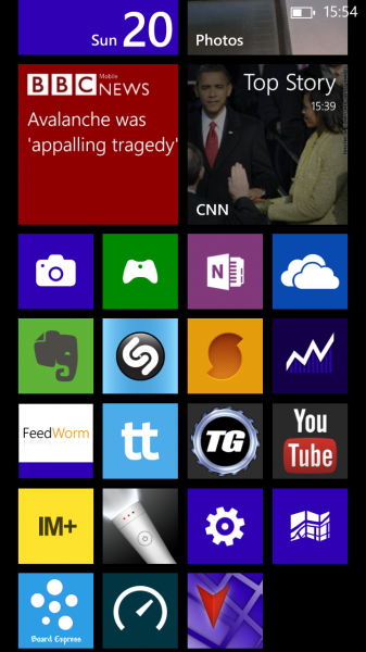
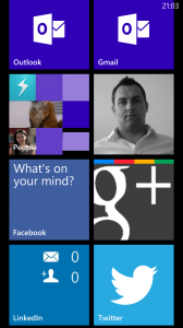
Which brings me to the live tiles. These display useful information, ranging from missed notifications, unread email counters, weather data, location, battery information and much more. They are great, but some developers have chosen not to bother enabling live tiles, which is disappointing seeing how useful they can be without even opening the app. Fact is, I have certain tiles pinned and never open the app because all the info that I need is automatically updated and displayed right there without any interaction from my end.
The Attractive Package
 I'd honestly have no hesitation in recommending Windows Phone 8 or the HTC Windows Phone 8X to anyone using Android or iOS. The basics are there, wrapped up in an attractive looking package and missing official apps can usually be replaced by easily found third party alternatives.
The only question that you have to ask yourself is this: What do I need that I can't get? You'll likely be surprised by your own answer, as I have been since buying the Windows Phone 8X. There are some negatives, but which operating system does not come with at least one? Breaking old habits is also one of the most difficult human limitations to overcome.
Stay tuned for the full review and an in-depth look at using Windows Phone 8.
Photo credit: Mihaita Bamburic
