Windows 10: Smooth user experience it ain't
Despite months of work, Windows 10 still falls a long way short of what it should be by now. Based on the last time I wrote about Windows 10 in a less than positive way, I'm not expecting great feedback on what I'm about to write. Of course, there is the caveat that we're all using a pre-release version of the operating system and problems are to be expected, but that’s not really the point.
The point is that Microsoft has been working on Windows 10 for quite some time now. Public builds have been a little slow to creep out -- despite promises that things would speed up -- but I'm concerned about how little time there is until the planned release. While there's a lot that right with Windows 10, there's an awful lot that's still very, very wrong.
I know I'm not alone in my disappointment; my colleague Wayne has written about how the operating system fails to meet his hopes. I've been using Windows 10 since it was first made publicly available, and with the release of build 10041 I decided to bite the bullet and move out of the safety of a VMware virtual machine; I installed Windows 10 as the sole operating system on the computer I use for, well, everything. So what are the issues?
I've outlined some of my complaints before, but using Windows 10 as my daily operating system has shifted my focus somewhat, and also highlighted some issues that either didn’t exist in previous builds or just hadn’t cropped up in my day to day usage. The first issue has to be that the UI is just all over the place. The mix of modern and legacy persists, and the jump between the two is quite jarring at times.
For example, the decision to introduce modern-style settings alongside the Control Panel would made sense if there was a degree of logic to having the two co-exist. As it stands, when one decides to change a system setting it's all but impossible to know whether you'll end up working with Settings or the Control Panel -- you get thrown from one to the other in a most nauseating fashion. Let's look at display settings.
I'm using a new operating system, so let's use the new way of changing settings -- i.e. via Settings. Firing up the pseudo-Control Panel from the Start menu and my eyes are assaulted by the monochromatic, outline icons that are more at home in Windows Phone (or Windows 10 for Phones). Even in the latest build, nothing has been done to make Settings elegant. Some will point to the minimalist icon as an example of refinement and elegance, but the hieroglyphs are often difficult to interpret and the amount of white space is astonishing. There is just so much wasted space!
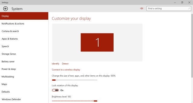
I'm interested in changing my display scaling settings. Nothing helpful to be found in the Display section. Let's click through to Advanced display settings. Still not a setting for me to change, but there is a glimmer of hope in the form of a link labeled "Advanced sizing of text and other items". Woah! Control Panel time! Forget a smooth, uniform experience, here we've been dumped unceremoniously from the modern UI to the legacy look of Windows. I have not the slightest problem with the legacy UI, but from an experiential point of view, the jarring jump is just horrible.
So here we’ve had two UI ideas to contend with. Nothing major, you might say, but inconsistency makes things unpleasant. How about if we try switching wireless networks? What's that experience like?
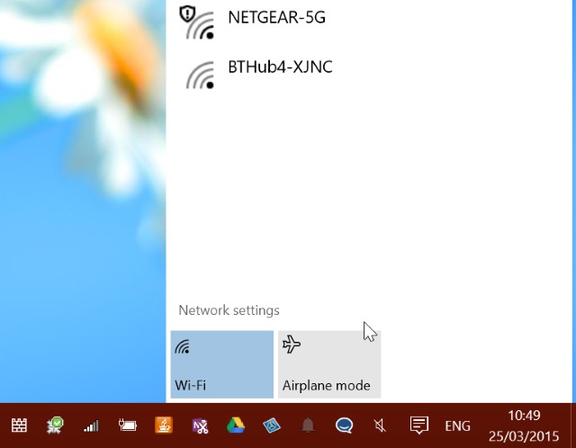
Click the Wi-Fi icon in the notification area and a Notification Center style pop up appears -- yet another design element! Ah... it seems that I'm on the right network, but things aren’t working as they should. I'll click the Network Settings link to see what I can do. Whoomf! Full screen Settings! I see a list of available connections, so what’s this "Show available connections" link? Let's click it and find out. Huh? A slide out Charms bar network selector? I thought that had been killed -- the Windows + C keyboard shortcut doesn't even work anymore. Weird. Back in Network & Internet settings, there's are lots of links to click in the Related setting section; click something like Network and Sharing Center, Internet options, or Windows Firewall and you're dumped back into legacy view. No fewer than four (!) different UI designs are used. This is cohesive? Insanity.
While I'm complaining about modern stuff (go ahead, call me a dinosaur, but it still seems like a step backwards to me), there's something else that bugs me. Why am I not able to run two instances of a modern app at the same time? I want to look at two PDFs side by side, but it's only possible to view one at a time using the Reader apps. Sure, I can switch between two PDFs open in the app, but not in the same way as switching between open documents in other apps. Rather than being able to Alt-Tab or Windows-Tab through things, I have to use a menu. Inconsistency once again.
I could install a second PDF tool that allows for multiple documents to be displayed side by side, but why should I? Sod it, I might as well install Adobe Reader and use it alongside Windows' own Reader -- at least then I can be consistent with my use of inconsistent interfaces. It takes me back to my previous complaint of Windows 10 being like a rollercoaster ride.
It seems that Microsoft is aware that Windows 10 could be something of a disappointment. So keen is the company to get it installed on as many devices as possible, the company recently announced that there will not be obstacles placed in the way of upgrading from pirated copies of Windows 7 and 8.
But is it all bad news? No. Despite what some people have found, Windows 10 is remarkably stable in daily use -- there's just an awful lot of tidying up still to do. My girlfriend also decided to take the plunge... after all, upgrading is an incredibly simple, pain-free (if rather slow) process. Her first words after completing the upgrade? "God, it's fast. It's like a completely new computer." Whether she stays impressed remains to be seen, but I'm still worried that Microsoft still has a long way to go to get Windows 10 back on track.
Based on how long it has taken Microsoft to get to this point, how confident am I that the niggles will be addressed? Not at all. I'm fully braced for continued disappointment.