Google Assistant gets a revamp and new features

Having introduced a new Voice Access app to allow for full voice control of Android phones, Google has also redesigned Google Assistant on both iOS and Android.
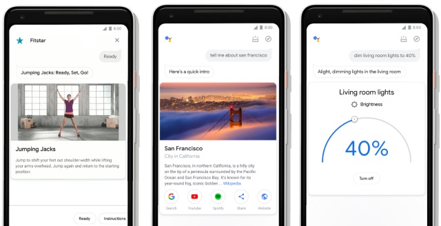
The revamp makes the app a more visual experience, with Google acknowledging that while the Assistant is a voice-activated tool, touch is also a key component. With the redesign, Google hopes that bigger visuals and new controls will make it easier and faster to get things done with a combination of voice and touch.
See also:
- Google's new Voice Access app lets you control your Android phone with your voice
- Android rooting tool SuperSU disappears from Play Store
- Android 9.0 Pie lands on OnePlus 6 in OxygenOS 9.0
With its presence on Google Home, it's little surprise the Google Assistant has long had a focus on voice controls. But with growing use on mobiles, as well as on other smart devices with displays, Google recognizes that touch has a part to play too.
Google highlights a number of changes that it says will help you get things done faster than ever:
- Bigger visuals that are easy to glance at quickly.
- New controls and sliders to manage your smart home devices. Use the dials to adjust your lights to the right brightness, or the sliders to control the volume of your smart speaker.
- An interactive messaging interface so you can use your fingers to add a comma, change a word or make any other quick edits as you compose messages.
- On Android phones, it's now easier to access an overview of your day. Open up the Assistant and swipe up on your screen to get curated information based on the time of day and your recent interactions with the Assistant.
- Developers and brands now have tools to take full advantage of the phone screen. Starbucks now has thumbnails to select from recommended items on their menus, Food Network has larger images of their recipes, and FitStar uses GIFs to give you a preview of your workout.
The redesign will be rolling out to Android and iOS handsets over the coming weeks.