Oh god... screenshots from Windows 10 build 10036 look worryingly like Windows Phone

OK, I'm starting to get worried now. I've been working my way through each of the public previews of Windows 10 and, on the whole, I've been fairly impressed. Not blown away, but generally satisfied. But some of the recent screenshots that have been leaking out have me a little concerned. -- there's more than just an air of Windows Phone, and that turns my stomach.
Yes, I know that there's meant to be a merging of paths between Windows for phones and Windows for the desktop, but for Microsoft to veer towards the look and feel of Windows Phone is a huge mistake. I only hope that the screenshots currently doing the round from build 10036 are not representative of the build we're waiting to be released.
What am I going on about? Well, we've already seen that Windows 10 is borrowing ideas heavily from Windows Phone. The Start menu has made a welcome return, but it's not The Start Menu we know and love from days of yore -- it's been Windows Phone-ified, all tiles and vertical lists. This is not news, but I should have been more worried earlier on, I think. When the much-talked-about Notification Center reared its head, it happened again. It's like looking at Windows Phone-lite.
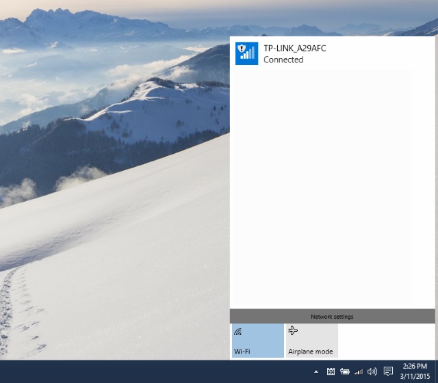
Not to worry, I thought... these are just early builds. These things will probably be ironed out, just like those pig-ugly icons. But now images are leaking which show that Windows 10 build 10036 continues the trend. The Wi-Fi network selection window has a new look. You've guessed it... it looks like Windows Phone. Don't believe me? Here's a screenshot posted on OSBetaArchive:

What are you doing, Microsoft? We're meant to be moving forward. Looking to the future, not the past. Have you not learned by now that Windows Phone was a mistake -- people don’t like it. To be fair, they weren’t all that keen on Windows 8.x either (although I'm more enamored than many people are). This in mind, why would you want to sully the look of the next generation of Windows with elements from such a wildly unpopular mobile operating system? It just seems like insanity.
My only hope is that I am not alone. If Gabe Aul's tweets are correct, we should start to see new builds of Windows 10 released more frequently. I hope in the name of all that is just that legions of Windows Insiders complain bitterly not just about the offensively ugly icons, but also the creep towards the look of Windows Phone that's taking place.
Other screenshots from 10036 posted by Wzor show something with a more desktoppy feel to it, but the continued existence of modern apps just adds to the Windows Phone look. Each of these apps adds a little more to the Phoney look and spoils things.
The journey towards the release of Windows 10 has been a complete rollercoaster ride for me. I've loved it, hated it, been ambivalent towards it. But this glacial creep towards Windows Phone is worrying. Windows Phone is a failure, and not without good reason. If Microsoft isn't careful, it'll be signing the death certificate for Windows 10 before its gestation period comes to an end.
Photo credit: Christos Georghiou / Shutterstock